A Tiny Tab Bar Change That Makes the Money Magician Dashboard Feel Completely Different
We added a floating glass tab bar to the Dashboard. Here's why a small navigation fix can have an outsized impact on how fast you understand your business.
Dashboards are only useful if you can move through them without thinking. We noticed that wasn't always true inside Money Magician.
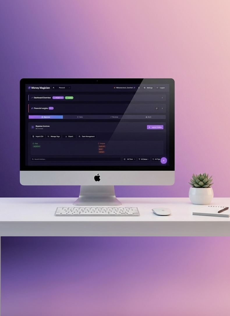
The Dashboard packs a lot into one screen: expenses, sales, revenue analytics, and bank reconciliation. Each section has its own tab at the top. That works fine when you first land on the page. But once you scroll down to look at charts, tables, or transaction lists, those tabs scroll out of sight.
The result? You lose context. You forget which lens you're looking through. And switching sections means scrolling back to the top, clicking, then scrolling back down. It's a small friction, but it compounds every time you use the app.
The fix: a tab bar that follows you
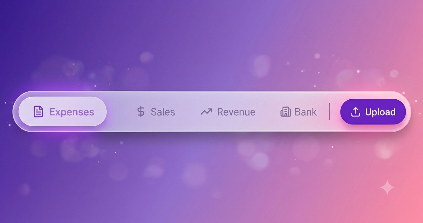
We added a floating, glassmorphic tab bar that hovers near the bottom of the screen. It contains the same four sections — Expenses, Sales, Revenue, and Bank — and stays in sync with the tabs at the top.
When the top tab bar is visible, the floating bar stays hidden. As soon as you scroll past it, the floating bar fades in. Switching sections works from either place; they share the same URL state, so the active tab is always correct.
Visually, we wanted it to feel light rather than heavy. The bar uses a translucent frosted-glass effect with a soft blur, a subtle inner highlight, and rounded edges. It floats above the content instead of sitting inside it, so it doesn't compete with the charts and numbers you're actually trying to read.
Why this matters more than it sounds
Most UX improvements are invisible when they work. This one is no exception — but the absence of friction is the whole point.
When navigation is always within reach, you spend less mental energy orienting yourself and more energy interpreting your numbers. You can jump from revenue to bank reconciliation mid-thought. You can scroll through a long transaction list and still know exactly which section you're in. The app stops getting in the way of the work.
We also built it with accessibility in mind. The floating bar uses proper tab roles, keyboard arrow navigation, and respects prefers-reduced-motion. On mobile, it accounts for the bottom safe-area so it doesn't sit under a gesture bar or home indicator.
What's next
This change is live now for every Money Magician user. No toggle needed — just open your Dashboard, scroll down, and the bar appears.
If you haven't tried Money Magician yet, the free plan includes the full Dashboard experience, bank reconciliation, and AI-powered insights. Take it for a spin and let us know what navigation tweaks you'd like to see next.
Frequently Asked Questions
What changed in the Dashboard navigation?
The Dashboard now has a second, floating tab bar that hovers at the bottom of the screen. It mirrors the existing Expenses, Sales, Revenue, and Bank tabs at the top. When you scroll down and the top tabs move out of view, the floating bar fades in so you never lose your place.
Why does a floating tab bar matter for usability?
Dashboards are dense. Once you scroll past the header, the original tabs can disappear, which means you have to scroll back up just to switch sections. The floating bar keeps navigation one tap away and gives you a constant reminder of where you are.
Does this work on mobile too?
Yes. The floating bar adapts to smaller screens, respects the safe-area inset at the bottom of phones, and supports keyboard navigation and screen readers. On desktop it shows labels; on narrow screens it keeps the icons so it stays compact.